[ad_1]
Microsoft Edge is finally getting vertical tabs, a feature that was promised a year ago. Announced Thursday, the rollout also includes a History feature that’s a cut-down version of a function available in older versions of the Edge browser.
The vertical tabs feature isn’t exclusive to Edge, but it’s not widespread yet either. Opera added them to its Neon browser in 2017, and they’ve been a feature of the Vivaldi browser since about that time as well. Chrome plug-ins also allow you to arrange your tabs vertically. Still, it’s a fairly profound revamp for Microsoft’s venerable browser, and it’s now generally available, Microsoft said.
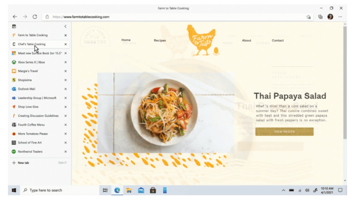
To enable vertical tabs, navigate up to the top left-hand corner of your browser window, where you’ll find a new icon that will shift your tabs into a vertical column. You’ll still see a familiar tab experience, with tabs and their index icons stacked one on top of the other. The vertical column allows more information about each tab to be displayed, such as the page title, at the cost of fewer tab icons available to see on the page versus the traditional, horizontal tab layout.
 Microsoft
 Edge’s new vertical tab layout.
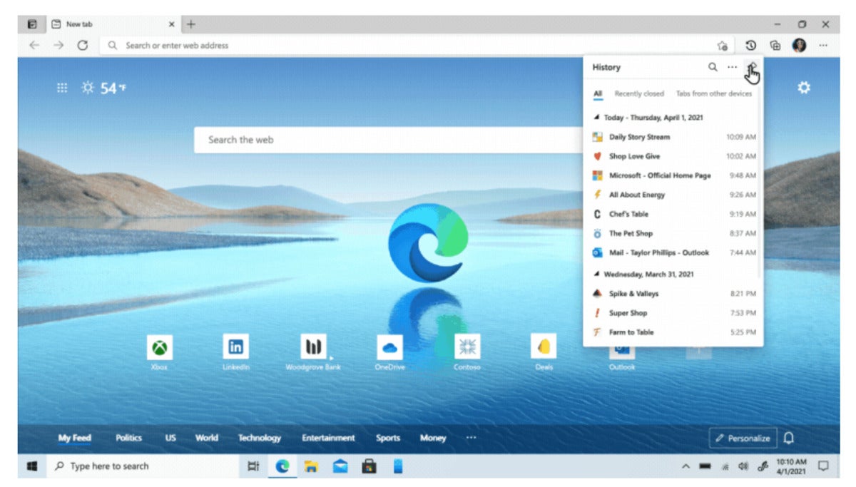
Microsoft is also adjusting the Edge History function of being able to view the sites you’ve recently browsed. In earlier versions of Edge, some of that history was available within the current browser window itself. In recent versions of Edge, History is confined to a new tab window, the same as in Google Chrome. Microsoft is now bringing that back into the browser, via the ellipsis (three-dot) menu in the upper right-hand corner. Click it, scroll down to History, and you’ll be able to browse the last dozen or so sites you’ve visited recently. That same menu will open via the CTRL-H shortcut, too, Microsoft says.
 Microsoft
 Edge’s browser history is now being placed inside the browser again, according to Microsoft.
In the blog post, Microsoft corporate vice president Liat Ben-Zur also highlighted several updates Microsoft is making to its Bing search results. Microsoft has said previously that it’s making a better effort to show off complex results in a simplified format. One example is recipes, which can be surrounded by reams of contextual stories and information that don’t do much to tell you how to cook a tuna casserole. When you search for a recipe, Bing will try to extract as much information as it can—an ingredient list, prep time, calorie count, and more—into a “card” that shows up on the main page.
Microsoft is also reorganizing some of its search results page if it thinks you’ll be more interested in a visual response, rather than just a text link or snippet. (An example is this “DIY coffee table” search.) Finally, the company said it’s tweaking some search results to show off “carousels” of pivoting, browsable search results, such as “chef documentaries.” Hover over an image, and the image will slide to the right and reveal more information.
[ad_2]
Source link