[ad_1]
Today, we’ve had our first glimpse at the next major version of Google’s operating system, Android 12. The company has released an early developer preview, which is now available for download for various Pixel phones.
According to Google, Android 12 is all about making the OS “more intuitive, better performing, and more secure.” Many of the changes you’ll find in this build are only for developers but will translate to meaningful experiences once the official, consumer-ready version of Android 12 is released later this year.
For now, let’s dive into the very first Android 12 developer preview.
Related: Android 12: Everything confirmed and rumored so far
What’s new in Android 12?

Credit: Jimmy Westenberg / Android Authority
As is the case with many other early developer previews, we aren’t seeing too many visual changes to the operating system. At least, we’re not seeing the big UI overhaul that was rumored a few weeks ago. However, there are still plenty of little changes here and there.
Android 12 notifications
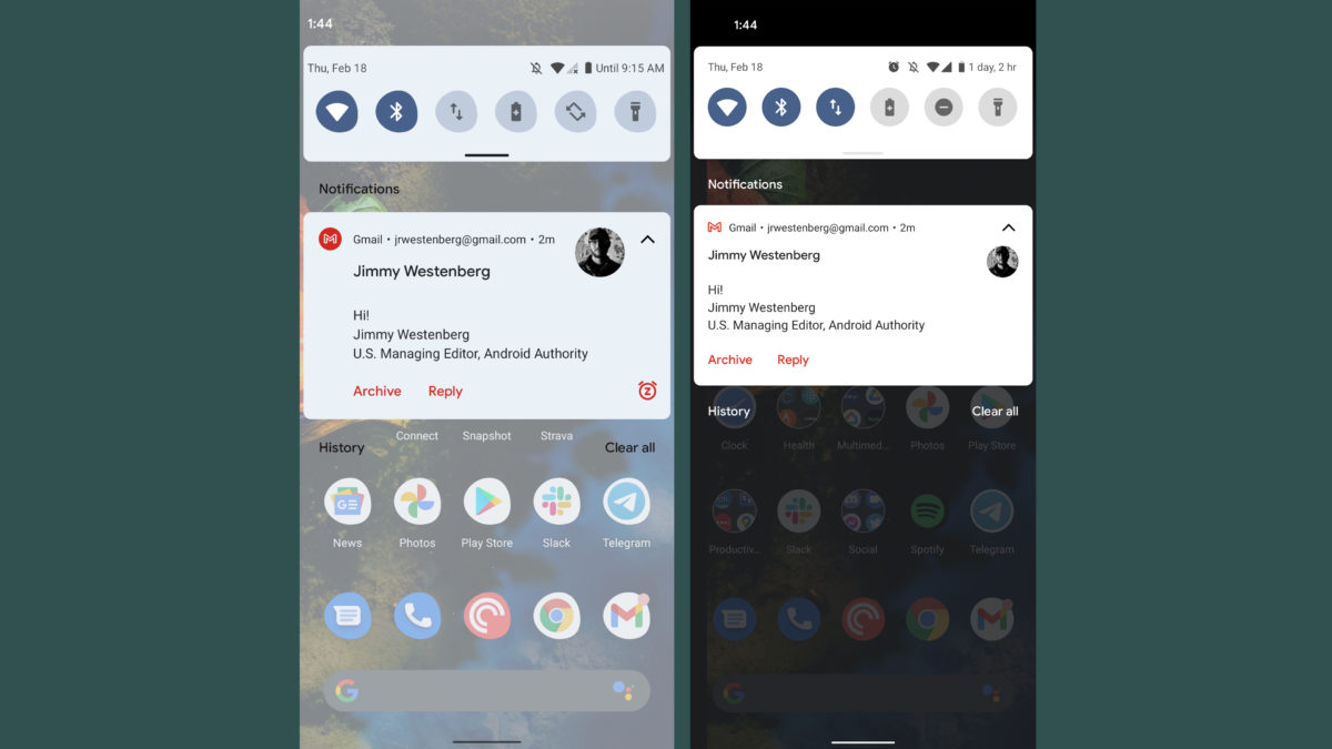
Google is yet again changing the look of the Android notification user interface. Notifications now have a more modern look. They take up about the same amount of space in the notification shade as before, but the layout and font size have changed. See the comparisons below for the difference as compared to Android 11. These are subtle changes, but ones you’ll no doubt notice if you’re used to the way Android currently handles notifications.

Left: Android 12 developer preview 1, Right: Android 11
Credit: Jimmy Westenberg / Android Authority
Google has added a handy little snooze icon on the bottom-right of each message notification. Tapping it allows you to quickly snooze the notification for one hour, 15 minutes, 30 minutes, or two hours.
Furthermore, the background of notifications and quick settings has changed colors. Android 11 had pure white or pure black backgrounds for both notifications and quick settings. As one would expect, the background depends on your system theme. Android 12’s backgrounds have a bluish tint to them, even if you’ve chosen another color for your accents. We’re not entirely sure why this changed Perhaps it could be part of Google’s rumored theming overhaul for Android 12? We’ll need to keep an eye on this for future releases.
 Loading poll
Google says it’ll be quicker to open apps from notifications in Android 12. Now, developers are encouraged to have notification taps trigger Activity starts directly instead of utilizing “trampolines” to start the Activity. These can cause significant delays, so Android 12 actually blocks notification trampolines. It does this by preventing them from launching target Activities. Google says the change will only apply to apps targeting Android 12.

Credit: Jimmy Westenberg / Android Authority
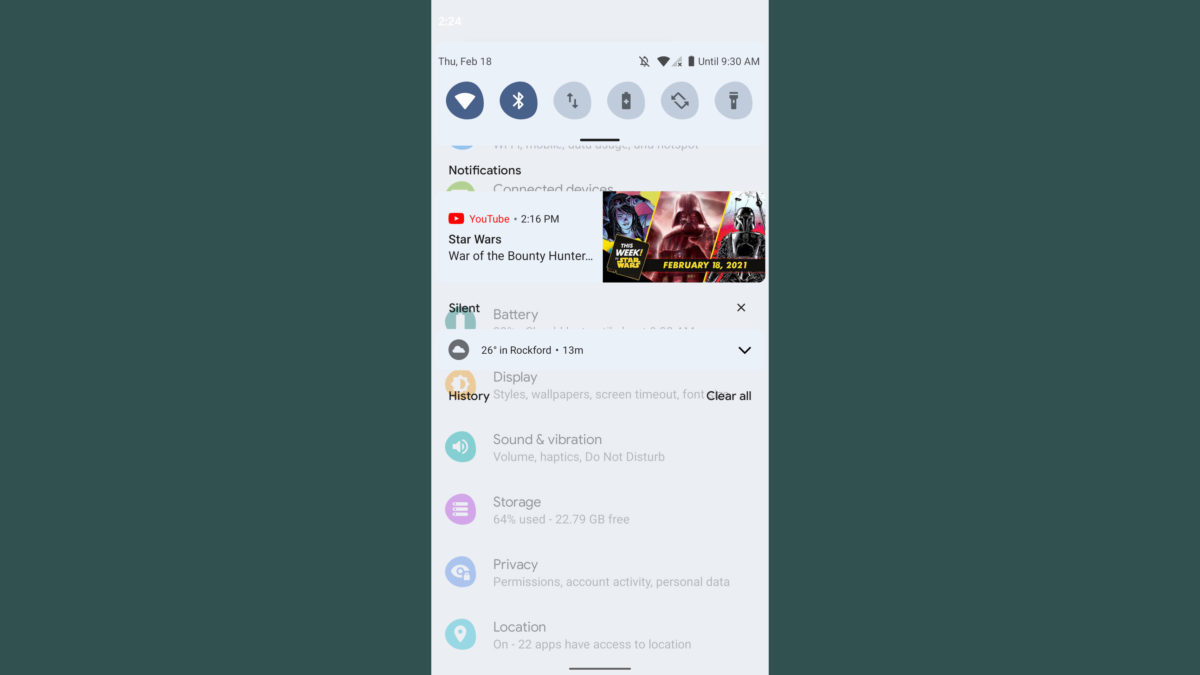
It’s important to keep in mind that this is a very early developer preview. Things will most definitely change in future releases. At least, I’m hoping Google changes the amount of dimming beneath the notification shade. Usually, pulling down the notification shade applies a dim underlay that lets you see your notifications more clearly. The dimming is nearly gone in Android 12, causing the monstrosity you see above when pulling down your notifications over the settings menu.
Settings
Certain parts of the settings menu are also getting a slight visual overhaul. The search bar on the top no longer stretches all the way to the right side of the screen. It’s a bit smaller now, while the profile icon on the right side has been enlarged.
A new Safety & Emergency section can be found in the settings menu. This new section gives you quick access to emergency information (contact info, medical details, etc.). There’s also car crash detection, crisis alerts, wireless emergency alerts, and a new Emergency SOS feature. Emergency SOS allows you to trigger an emergency action by quickly pressing the power button five times or more.
By default, the Emergency SOS feature is set to dial 911, but this number can be easily changed. However, if you enter a non-emergency number, your phone must be unlocked to use it.
The settings menu will likely get even more of a revamp in future releases. XDA’s Mishaal Rahman found a one-handed mode that can be enabled via a feature flag on some Pixel devices. This essentially applies a Samsung One UI-like layout to the settings menu, complete with large text headers and a layout that should be much easier to reach on big-screened devices. See above for some examples.
Quick settings panel
If you aren’t a fan of certain media players appearing in your quick settings panel, you can now turn that off on a per-app basis. You can do this through a new option in the sound & vibration settings menu. Thankfully, it allows you to toggle on and off each media player you have installed on your phone. So, if you don’t want YouTube to appear in your quick settings but would like to keep Spotify or Pocket Casts, you can now make that happen.

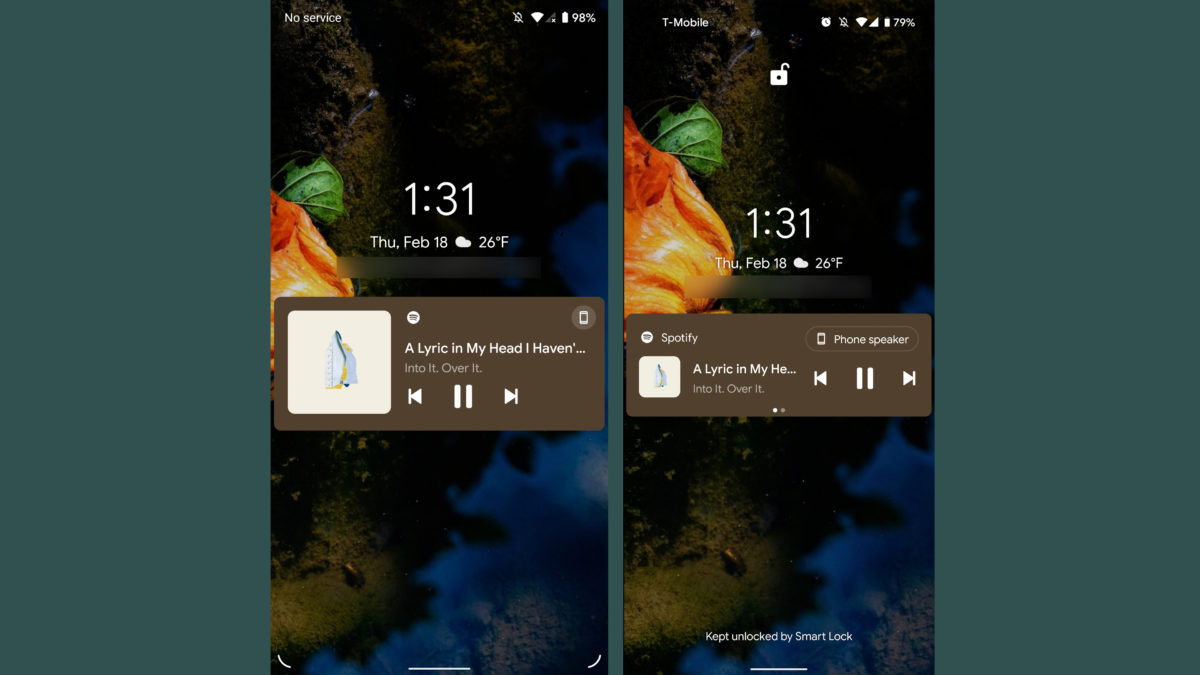
Left: Android 12 developer preview 1, Right: Android 11
Credit: Jimmy Westenberg / Android Authority
Additionally, it should be a little easier to parse those media player notifications on your lock screen and in your quick settings menu. Google has made the media notifications a bit larger. Now, the song title and artist are shown on a single line at the top of the notification. Meanwhile, the player controls are on the bottom and the album artwork is on the left side. It looks a little less compact than before.
Other new Android 12 features
Android 11 already allowed for easier Wi-Fi network sharing, but Android 12 makes it even easier. Now if you’d like to share your Wi-Fi network with someone, just tap the Nearby button that now appears on the Wi-Fi network share screen. That will use Android’s Nearby Share feature to send the Wi-Fi credentials to whomever you’d like. See below.

Credit: C. Scott Brown / Android Authority
Ah, yes. It wouldn’t be an Android developer preview if we didn’t mention scrolling screenshot support. It’s a feature for which we’ve been clamoring for years. Thankfully, it looks like Google is one more step closer to making it a reality.
Again, XDA’s Mishaal Rahman pointed out that Android 12 does indeed have scrolling screenshot support — but it’s not enabled yet. We’re really hoping Google enables this sometime soon. This feature has literally been rumored since April 2019.
Important Android 12 features you can’t see

Credit: Edgar Cervantes / Android Authority
As always, there are many more developer-focused changes in this early build that we haven’t had a chance to try out. You can see the full list on the Google Developers website. We’ll also round up some of the most important changes here.
Haptic-coupled audio effects
We often talk about how important haptics are to the overall user experience of a smartphone. In Android 12, Google is adding support for haptic-coupled audio effects through your phone’s vibration motor. By using this tool, developers will be able to create more immersive game and audio experiences from the vibration strength and frequency that are derived from audio sessions. Google gives the example of a video calling app using custom ringtones to identify callers through haptic feedback, or a racing game simulating rough terrain through vibration. We have not had a chance to test this feature out, but we’re very excited to see how it works.
Improved Android 12 gesture navigation in immersive mode
Immersive mode kicks in when viewing a full-screen video, game, or reading a book. Usually, Android’s default gesture navigation requires users to swipe in from the side, then again to go back to the previous screen. Now, that second swipe is no longer necessary in things like video viewers or photo galleries: the new default in Android 12 for these circumstances allows you to swipe just one time to go back. Google says it’s still protecting apps from accidental gestures, but this should make exiting full-screen experiences much less cumbersome. If you’re running Android 12, you can try this for yourself by looking at a photo in Google Photos in full-screen mode, then swiping back from the side. Way easier than before.
Project Mainline improvements
Unfortunately, Android has always been associated with slow software updates, but Google is doing its best to make that a thing of the past. In Android 12, Google has added the Android Runtime (ART) module to Project Mainline. By adding this module, Google can issue improvements to runtime performance, manage memory, and make Kotlin operations much faster without requiring a full system update.
HEVC support for unsupported apps
Many of today’s camera apps are able to capture in HEVC format thanks to hardware encoders built into mobile devices. Some apps don’t support the format. For those apps, Google is introducing compatible media transcoding into Android 12, which transcodes files into the AVC format even if the app doesn’t support HEVC. Google says the transcoding process takes time: a one-minute 1080p video at 30fps takes around nine seconds to transcode on a Pixel 4. It will be incredibly easy for developers to opt-in to the transcoding service, too.
Android 12 AVIF image support
- AVIF image (18.2kB)
- JPEG image (20.7kB)
Android 12 introduces support for AV1 Image File Format (AVIF). This image format uses the intra-frame encoded content from video compression. In theory, this could “dramatically” improve image quality for the same file size when compared to JPEG images. See above for an example.
Easier rich content insertion in apps
Google is making it easier for apps to move and receive rich content like images, videos, audio files, and more. Android 12 introduces a unified API that lets apps accept content from any source, be it a clipboard, keyboard, or drag and drop. Through a new interface called OnReceiveContentListener, apps will get a callback when content is inserted from another source. This interface is where all content insertion will be handled, no matter the content type.
Multi-channel audio improvements
Android 12 adds support for MPEG-H playback in passthrough and offload modes. Additionally, audio mixers, resamplers, and effects have been optimized for up to 24 channels.
Optimizations to foreground service
Android 12 will block foreground service starts from the background for applications that target Android 12. To help make this possible, Google is introducing a new expedited job in JobScheduler that gets elevated process priority and runs immediately regardless of battery constraints. This should lead to fewer killed apps and smoother app performance. Android 12 will also delay some foreground service notifications by up to 10 seconds, allowing short-lived tasks a chance to complete before notifications are shown. Translation: fewer distractions for users when opening apps from notifications.
When will Google release Android 12?

Credit: Edgar Cervantes / Android Authority
Google has released a tentative Android 12 launch date timeline for all its developer previews and beta builds. Google has three developer previews scheduled: one in February, one in March, and one in April. There will be four betas in all, starting in May and ending in August.
You’ll notice the “platform stability” signifier is listed for Android 12 beta 4 and the final release. This is when Google plans to begin final compatibility testing for apps, SDKs, and libraries.
As for the final Android 12 release date, Google isn’t giving us many hints. Granted, it’s possible we could see the full rollout in late August. Although, we’d wager Google would wait until early- to mid-September for the full Android 12 rollout.

By comparison, Google launched the first Android 11 developer preview on February 19, 2020, the first beta on June 10, 2020, and the full version of the OS on September 8, 2020. The company has historically stuck closely to its dev preview release schedules. With that in mind, as of now, we can expect the Android 12 release date to be on time.
Also read: Android 11 review: The devil is in the details
Should you install Android 12?
As with all developer previews, you should install them at your own risk. This is only the first developer preview for Android 12, and it’s meant only for developers. If you choose to install it, be aware that you may run into significant performance-related bugs and various software issues. Generally, it’s a good rule of thumb to hold off on installing early builds of Android at least until the first beta build arrives. Even then, you can expect to run into a few annoying bugs.
If you own a Pixel and use it as your primary device (and if you don’t have a secondary device), we do not recommend installing the first Android 12 developer preview. However, if you have a secondary Pixel smartphone lying around that you don’t regularly rely on, then go crazy. You can follow these instructions to install Android 12 on your Pixel.
 Loading poll
Our take on Android 12 so far
![]()
Credit: Jimmy Westenberg / Android Authority
With Android 12, Google is indeed making its operating system more intuitive. I like the new, modern look for notifications, the simpler settings menu, and many of the small quality-of-life tweaks that you may not notice right away. There are a lot of those little changes, but they all add up in the grand scheme of things.
There are lots of little changes in Android 12, and they all add up.
I’m excited to see how this version develops with future releases. I have a feeling Google has a lot more planned in the coming months. There’s a good chance the version we see today will evolve into something completely different by May.
Of course, stay tuned to Android Authority as we uncover even more Android 12 features in the coming days.
[ad_2]
Source link

